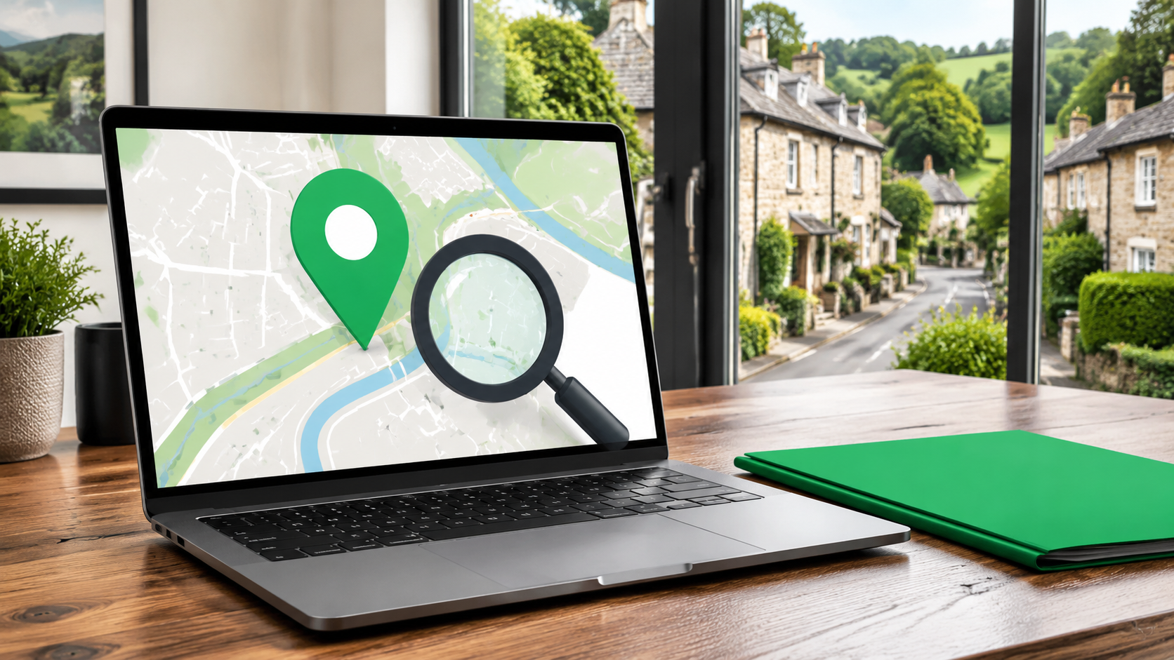
Discover practical steps to help your Devon business appear in local results and attract more customers.
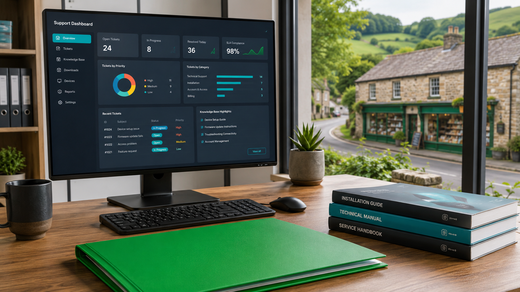
Discover why ongoing support is crucial for digital success. Follow steps to keep your website and apps secure, effective, and ready to win enquiries across Devon, the South West, and Cornwall.
Learn how mastering the digital journey turns website visitors into loyal customers for small service businesses in Devon and the South West. Practical steps included.
Discover how to build a strong online presence small business with practical digital tools, websites, apps and local visibility strategies that win more enquiries.
Discover how to boost your digital reach for local business, expand beyond geographical limits, and drive growth with practical tools tailored for Devon and South West firms.

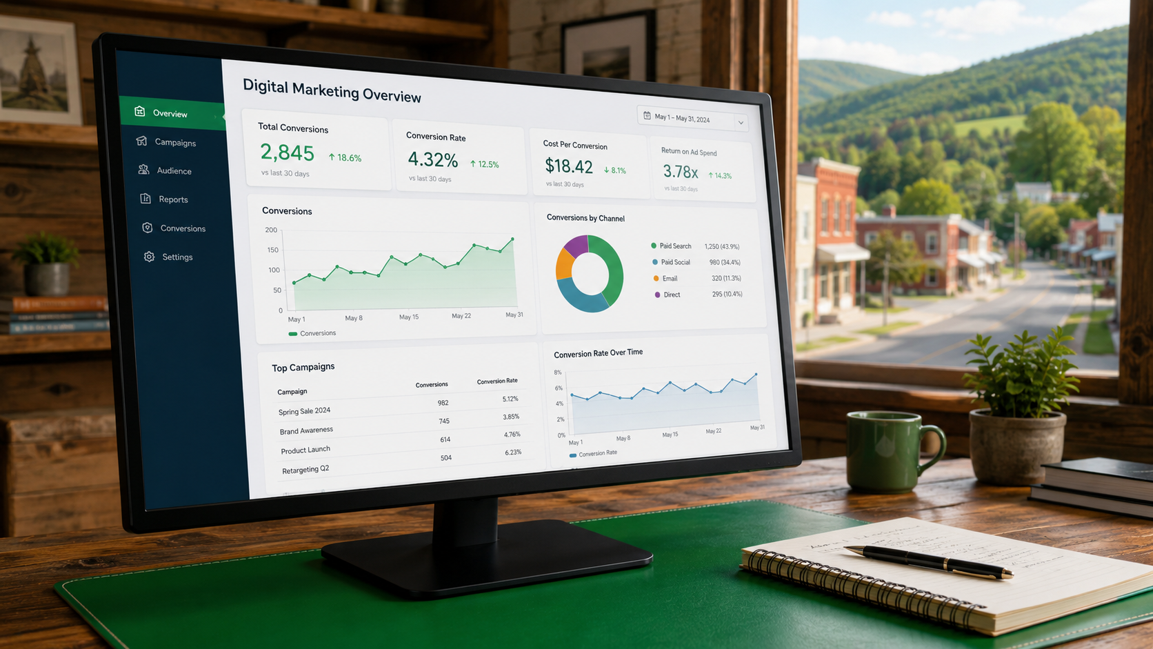
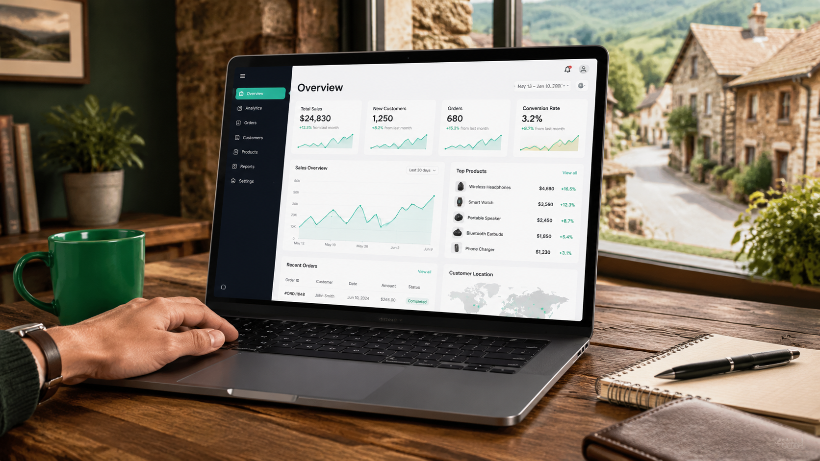
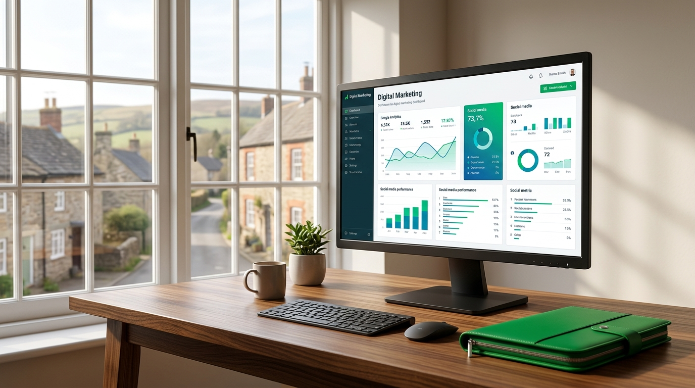
Master website analytics for small business growth in 2026. Explore trends in website performance tracking and conversion rate analysis to turn data into more leads and enquiries.
Explore 7 key opportunities in Website Accessibility UK for small businesses. Tap into new markets, boost SEO by 20%, cut bounce rates, and generate more leads with inclusive web design.
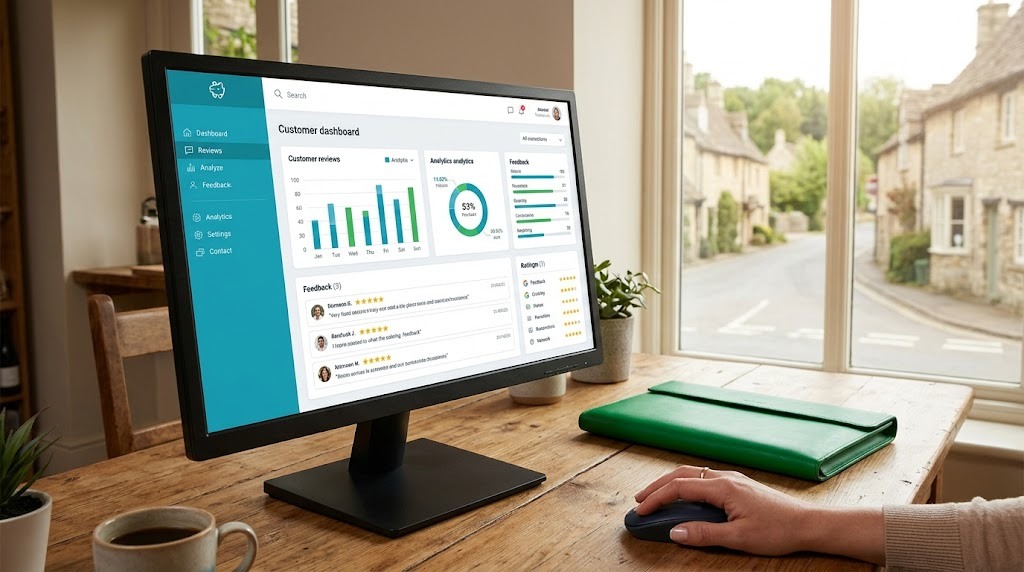
Master online reputation management for small business with this actionable guide. Learn strategies for managing online reviews, encouraging feedback, and boosting local business reputation to drive more enquiries.
Unlock the power of digital storytelling for local business growth. Learn how to craft authentic narratives that build trust, engage customers, and drive enquiries across Devon and the South West.
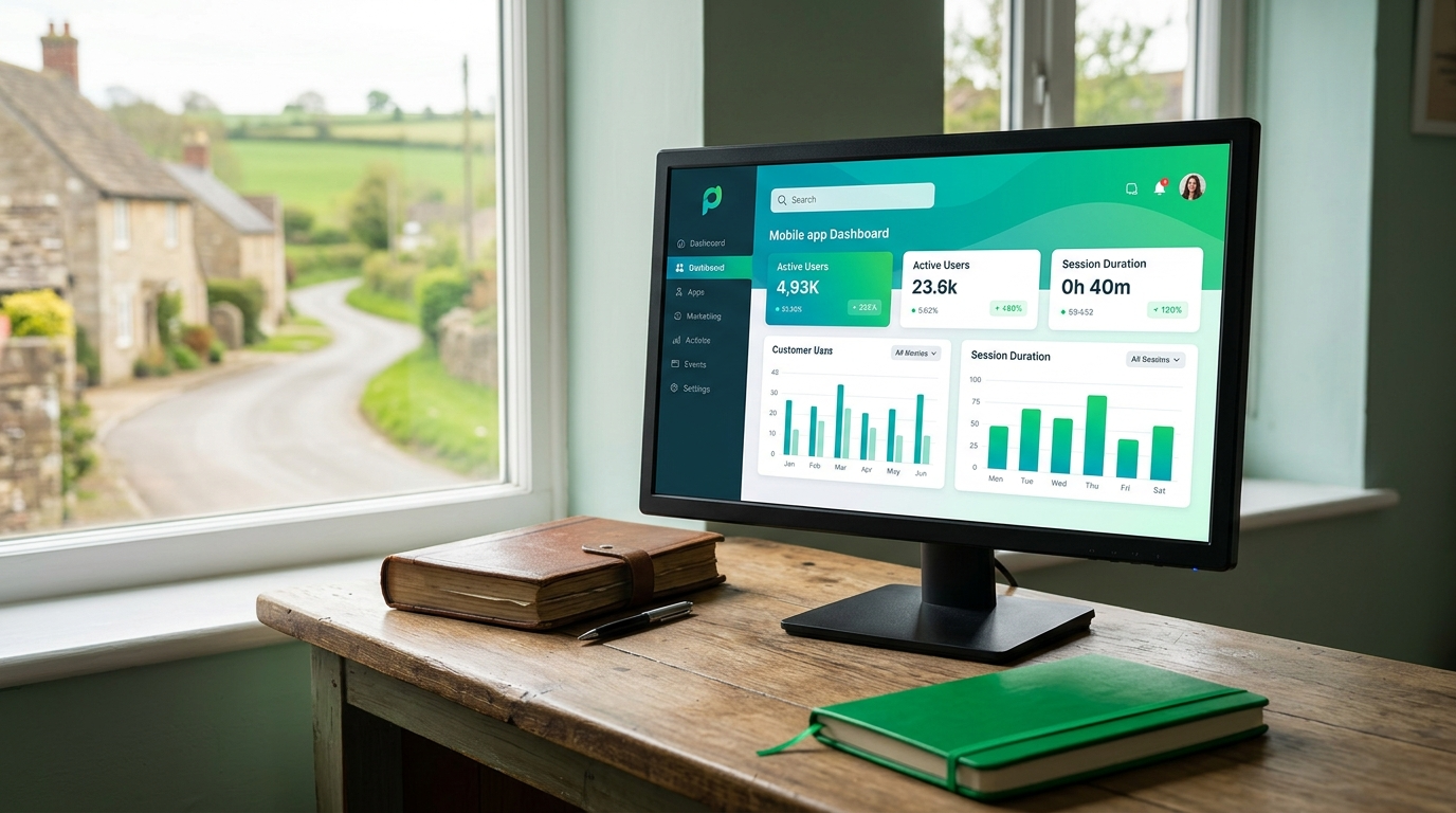
Unlock mobile app customer engagement to build loyalty and drive sales for your small business. Learn practical tactics like push notifications and bespoke apps from MidDevon Digital experts.