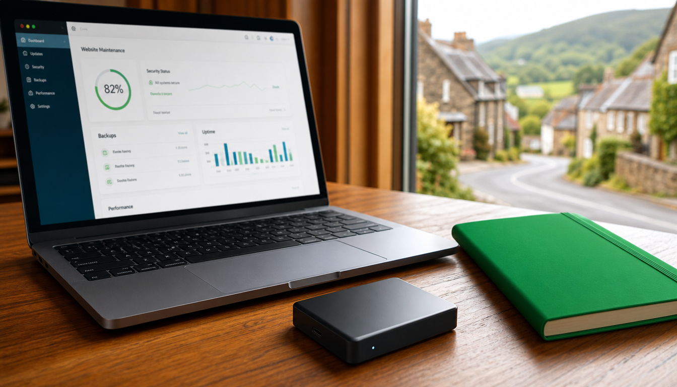
Discover what ongoing website maintenance offers small businesses in Honiton, including updates, security checks, and performance monitoring to protect your online presence.
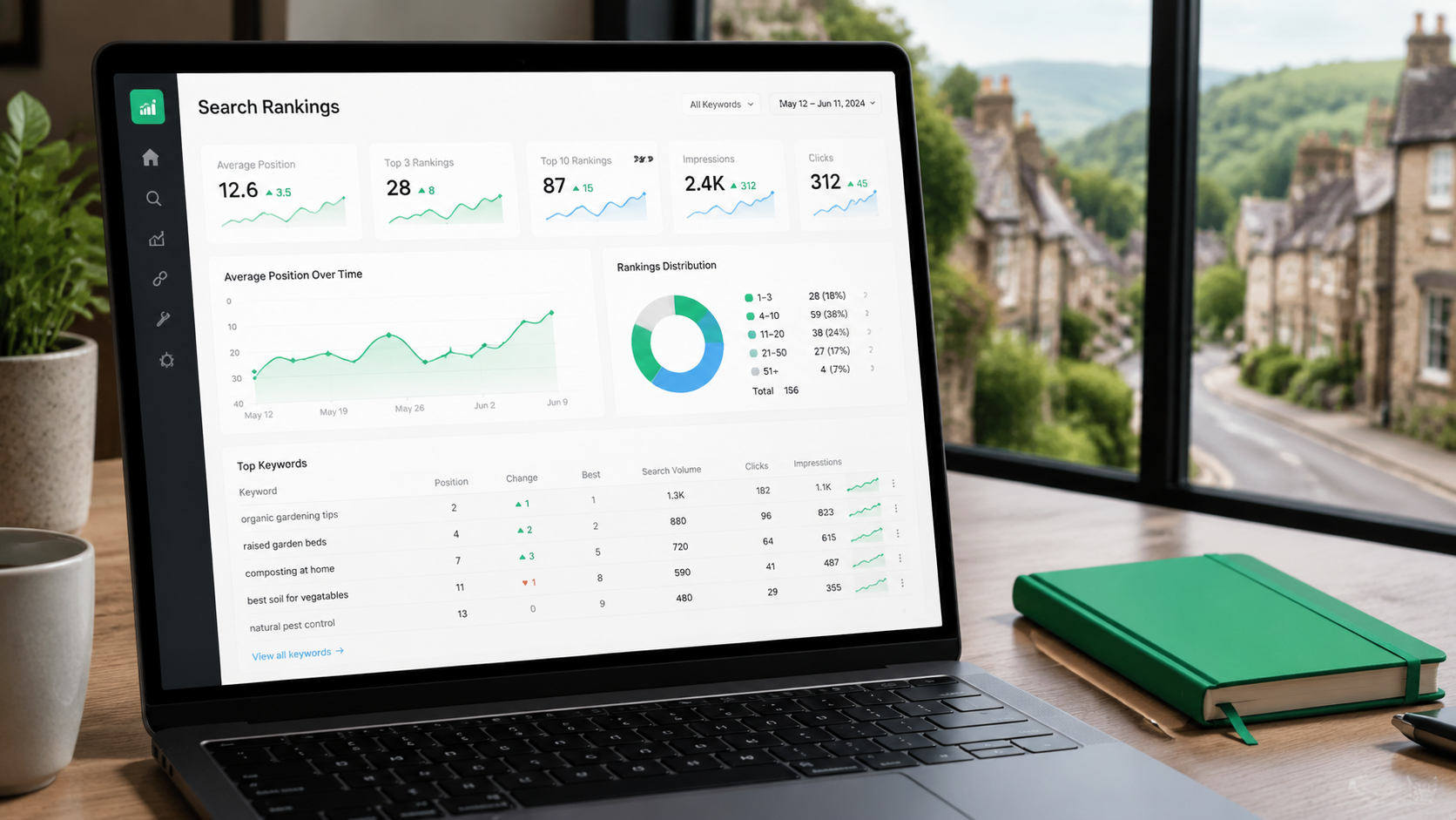
Discover how to evaluate if a Newton Abbot web designer creates sites that rank well on Google and convert visitors into enquiries.
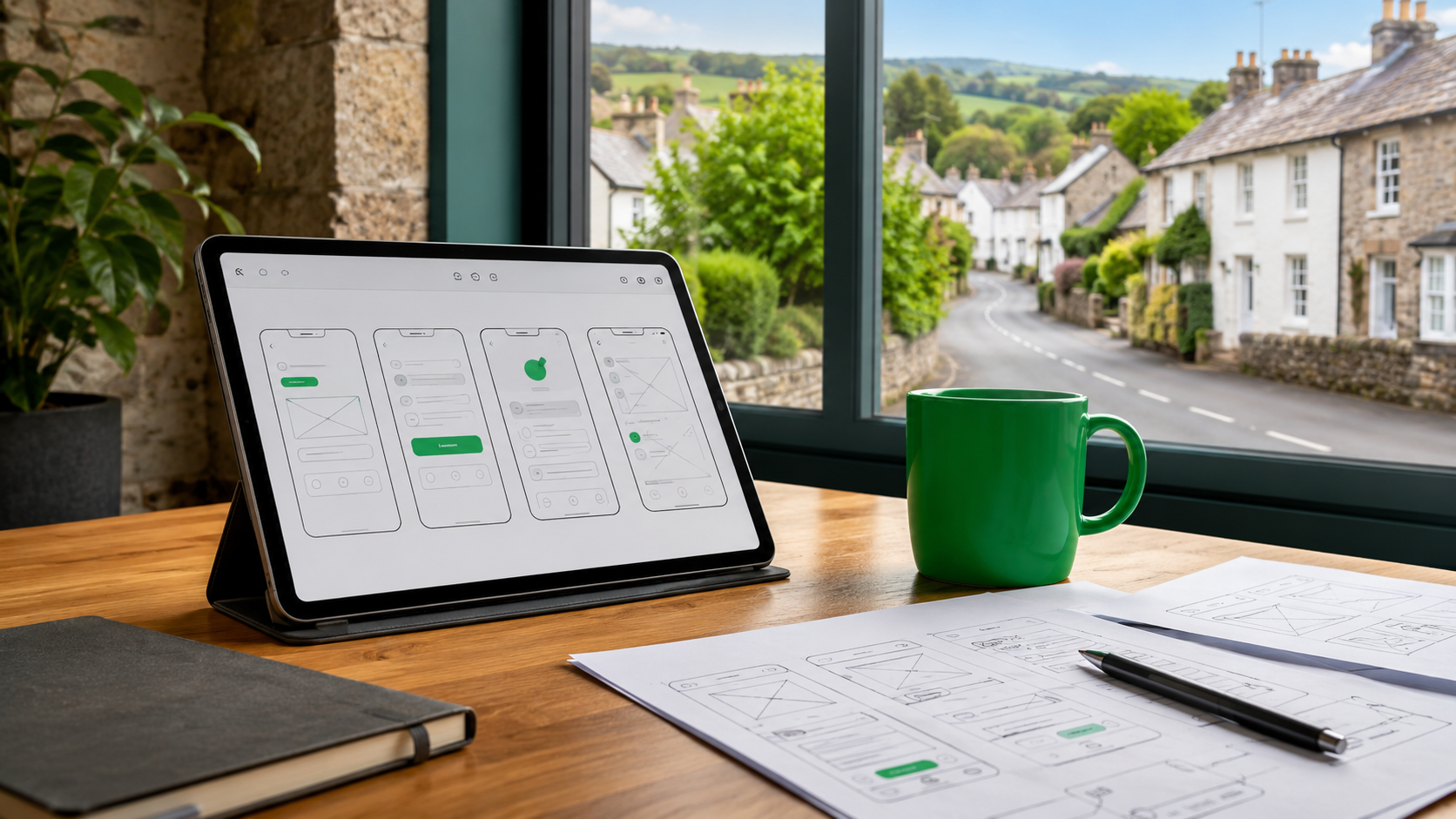
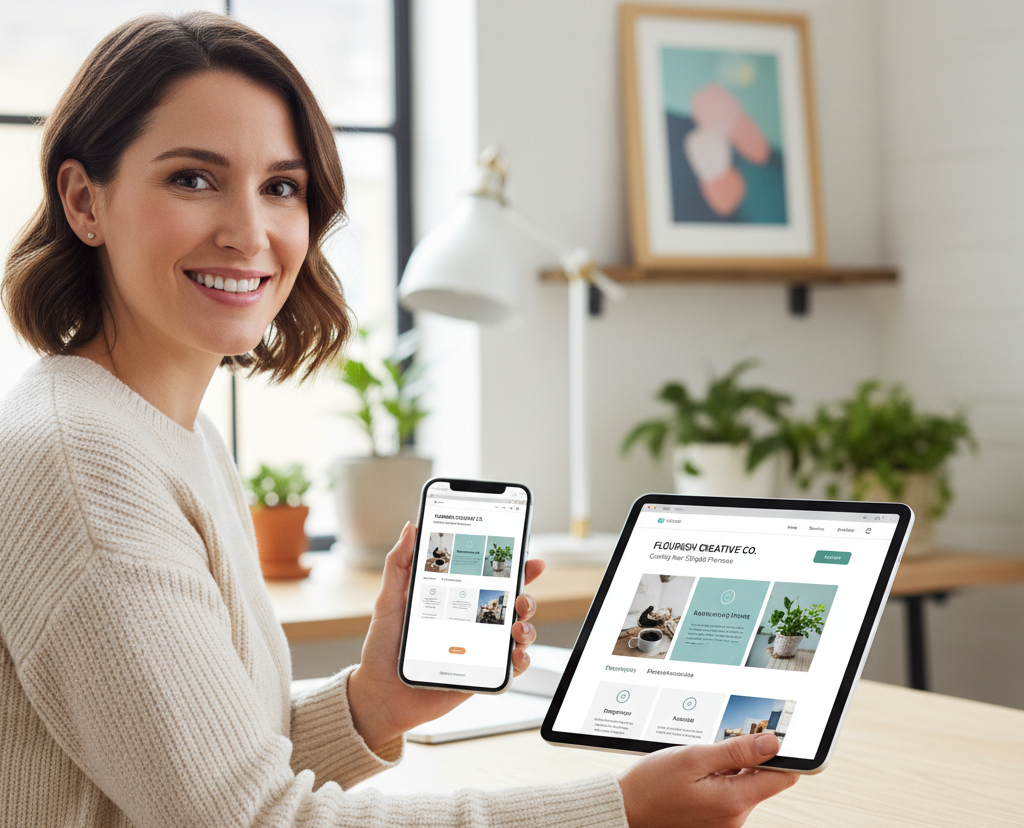
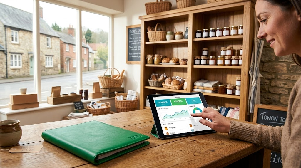
Discover how mobile app development in Devon helps owner-led businesses build custom apps that improve customer engagement and create more enquiries.
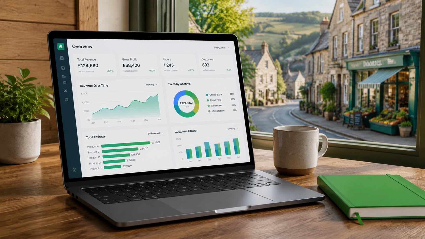
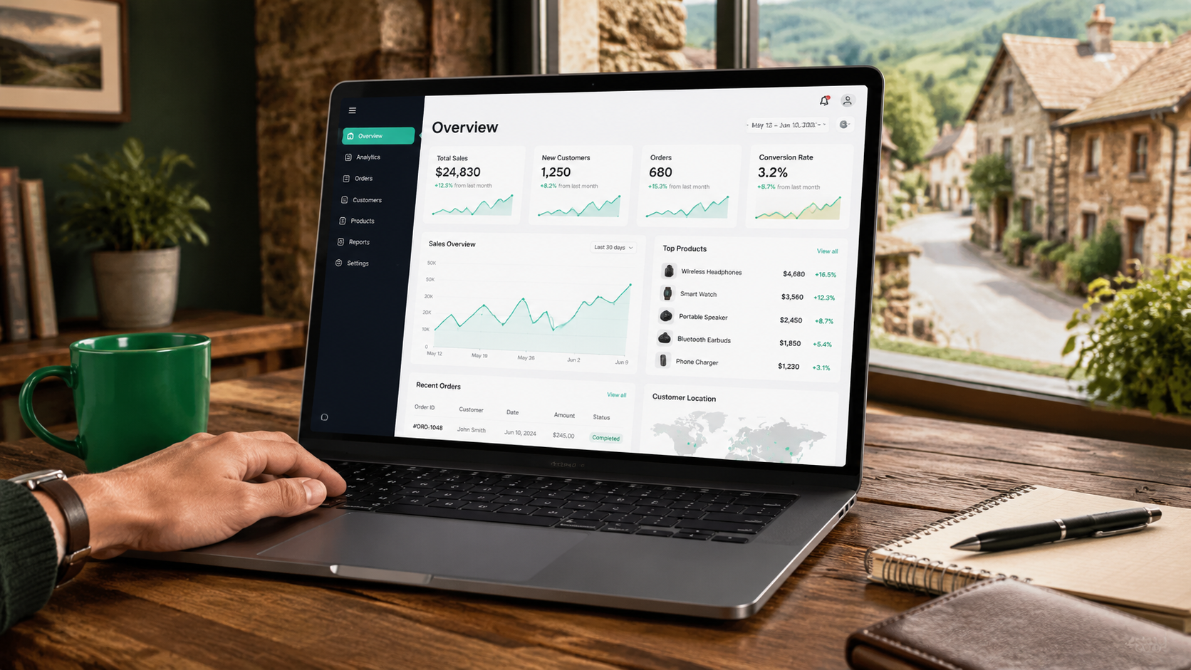
Discover how bespoke web applications in the UK help businesses cut admin time, reduce errors, and improve workflows with tailor-made digital tools.
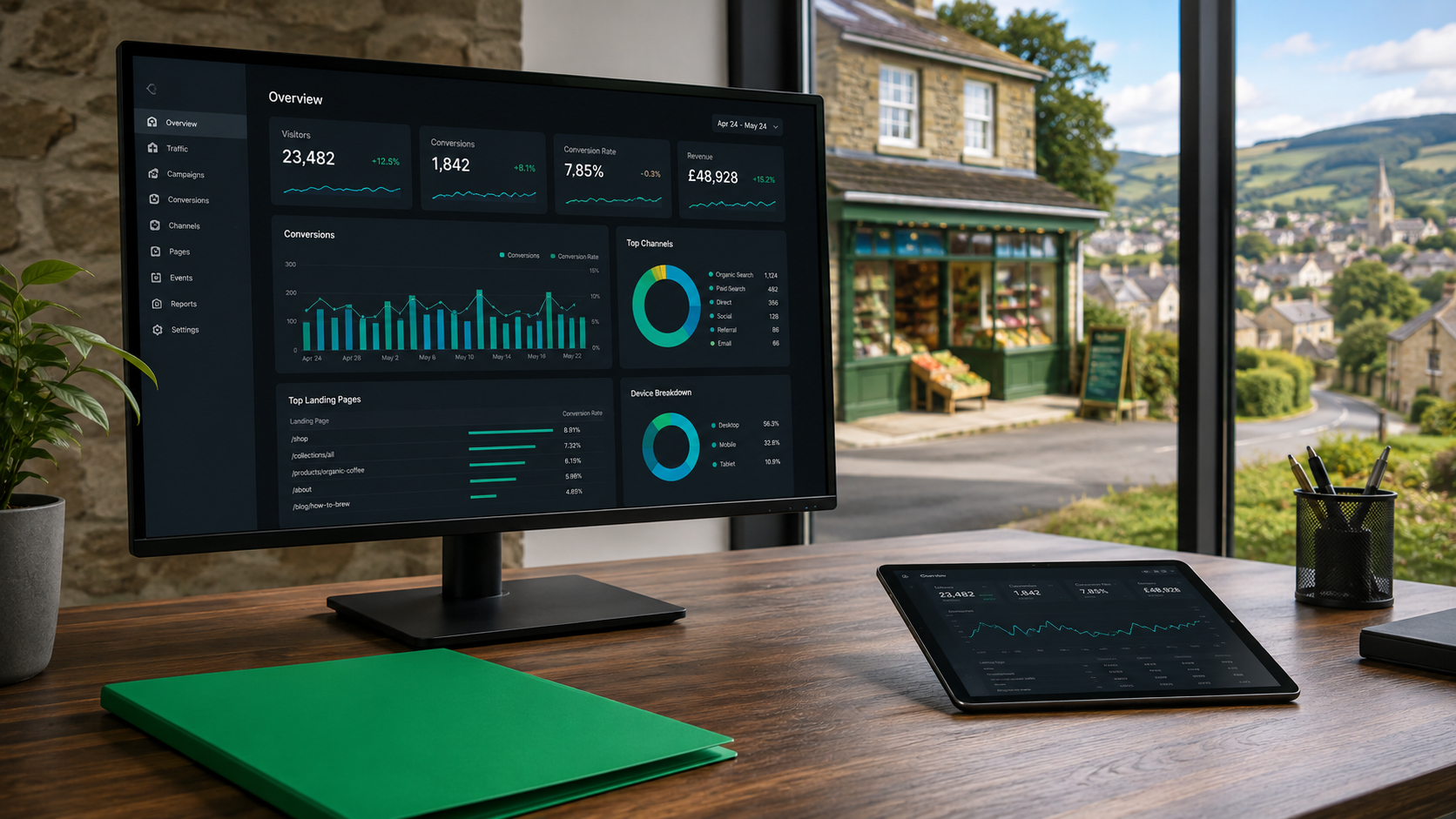
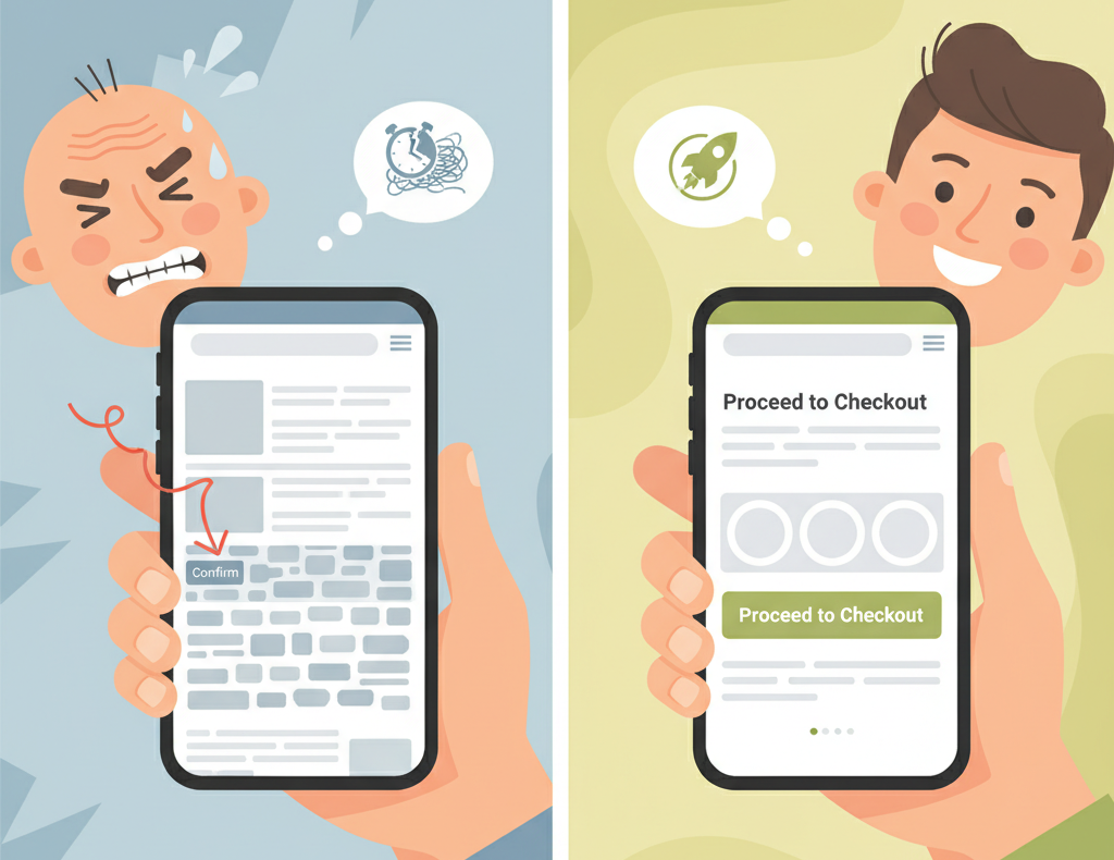
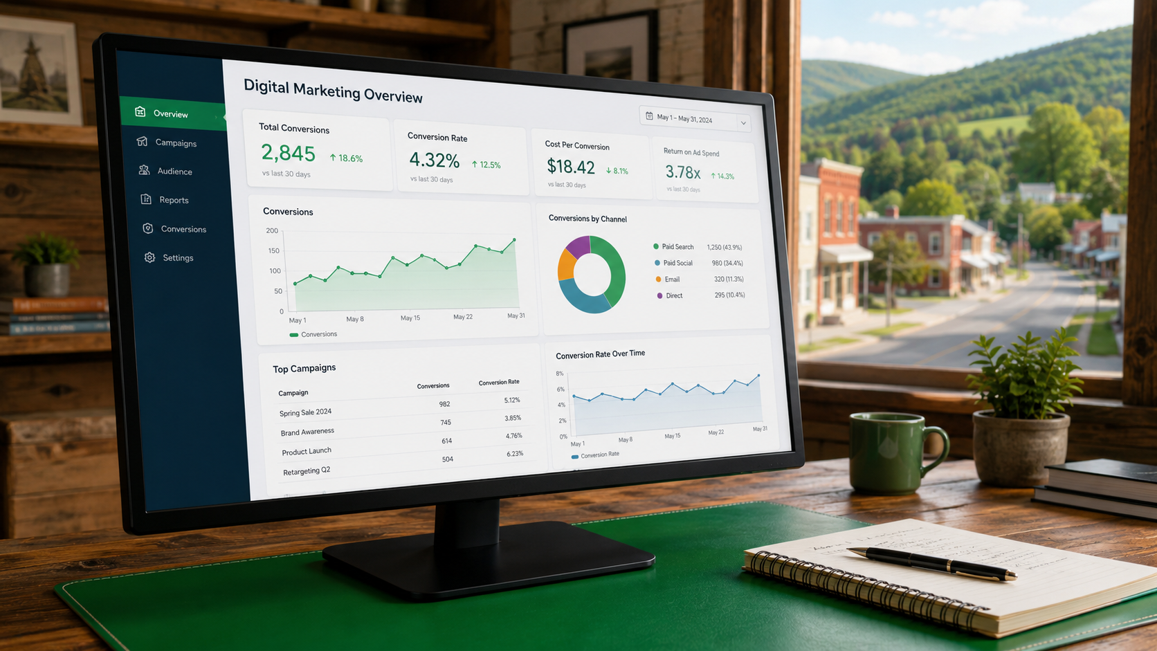
Discover how conversion-focused websites help Devon service businesses turn visits into enquiries through clear design and strong mobile performance.
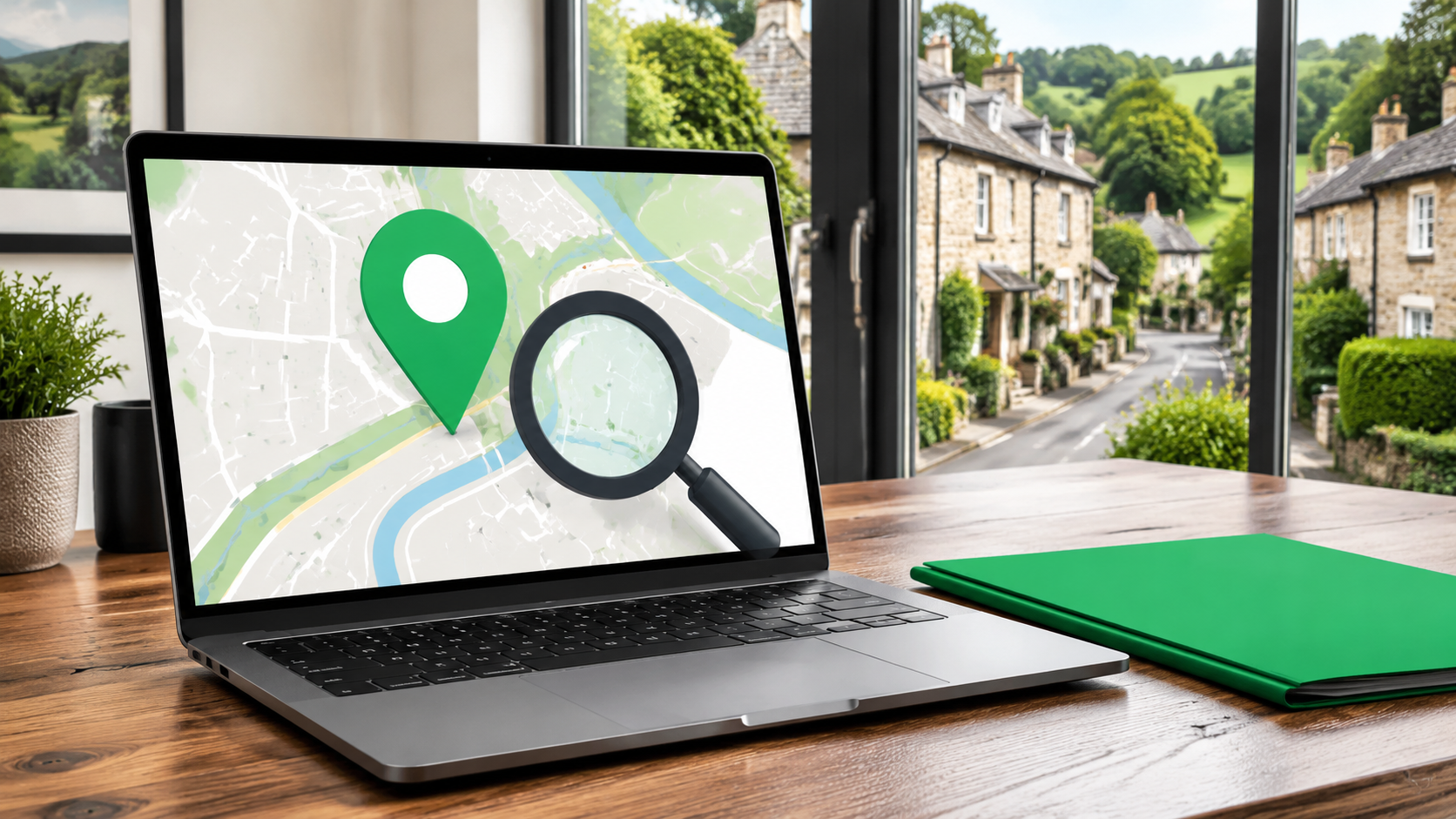
Discover practical steps to help your Devon business appear in local results and attract more customers.
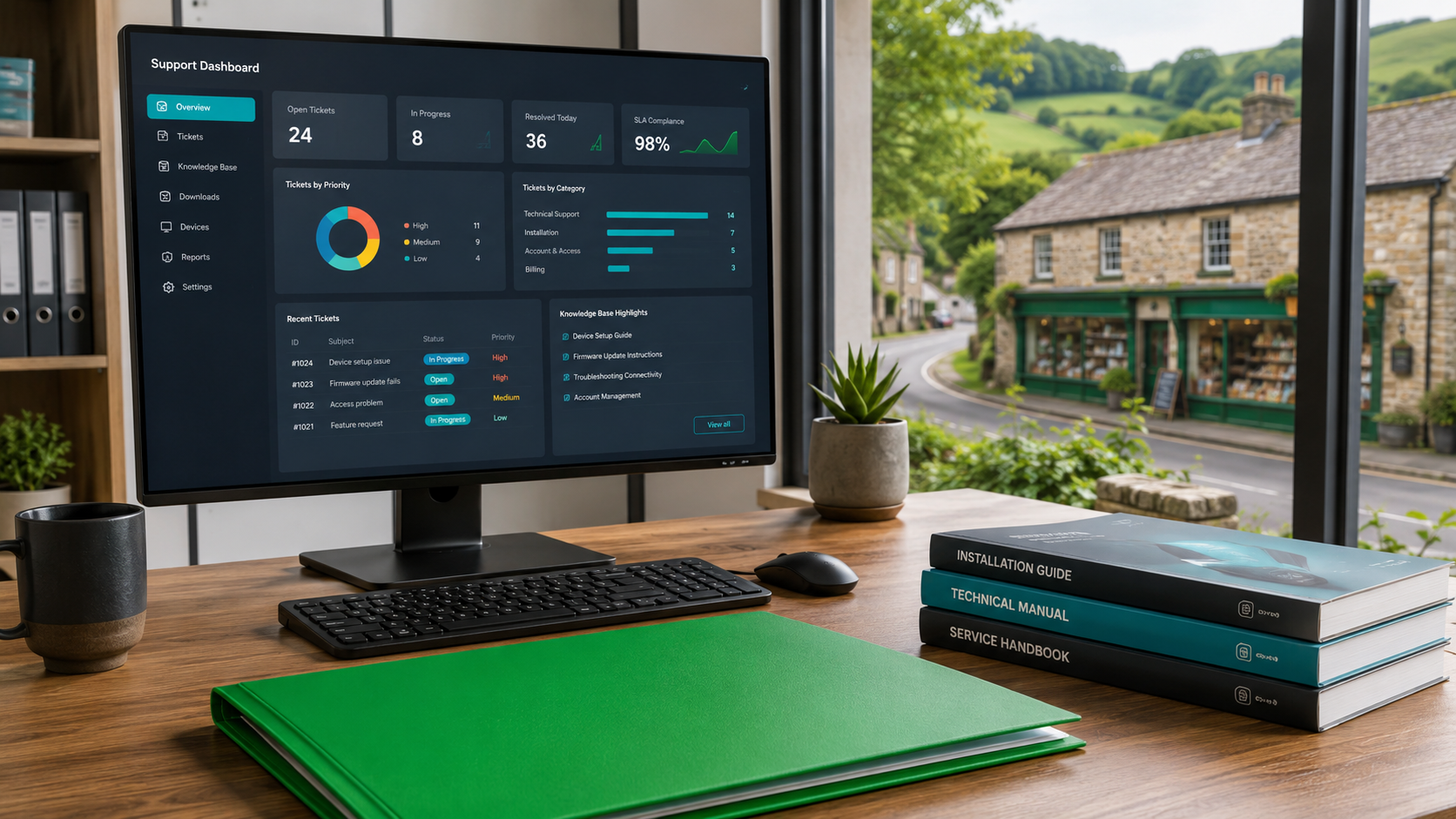
Discover why ongoing support is crucial for digital success. Follow steps to keep your website and apps secure, effective, and ready to win enquiries across Devon, the South West, and Cornwall.
Learn how mastering the digital journey turns website visitors into loyal customers for small service businesses in Devon and the South West. Practical steps included.
Discover how to build a strong online presence small business with practical digital tools, websites, apps and local visibility strategies that win more enquiries.
Discover how to boost your digital reach for local business, expand beyond geographical limits, and drive growth with practical tools tailored for Devon and South West firms.